無論是學校作報告或公司發表簡報,若能在內容中穿插數據 (figures / data) 和圖表 (graphs / charts / diagrams / tables),能夠有效提升可信度和專業感。英文簡報也是如此。
最常使用的三大類圖表英文:
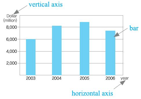
① 柱狀圖:Bar Graph
<你可以這樣說>
・Why don’t we look at the bar graphs?
我們何不看看這個柱狀圖?
・Let me illustrate this point with a bar graph.
讓我用柱狀圖來說明這一點。
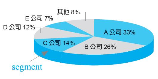
② 圓餅圖:Pie Chart
<你可以這樣說>
・As you can see from this pie chart, our profit margin takes up a very small portion.
各位從這個圓餅圖可以看出,我們的利潤只占了非常小的一部分。
・In this pie chart we have the total consumption of milk, with each segment representing the top five brands in Taiwan.
這個圓餅圖表示所有牛奶的消費量,而各個區塊則代表台灣的前五大品牌。
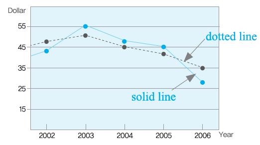
③ 折線圖:Line Graph
<你可以這樣說>
・The dotted line represents profits while the solid line stands for total costs.
虛線表示利潤,實線則表示總成本。